While gathering ideas for a summer sipping round up, I kept repeating: “Don’t judge a book by its cover.” But the truth is we judge almost everything by its covers. Books, dish soap, albums, even booze… As design enthusiasts, you know that particular colors, architecture, shapes, and materials can evoke a mood and feeling. A great cover, or bottle label in this instance, serves as a visual storyteller, expressing the essence of a brand and its offerings effectively. Granted what you see on the outside is not always a true indicator of what you’ll find behind the surface… Dubbed as “Marketing Magic,” I had the chance to explore the narratives behind the shelf appeal of three brands and put their claims to the taste.
Doce Mezcal
Gabriela Lawrence, Gabby Arce, and Mia Tonelli have high standards. So, when they decided to get into the Mezcal business, they wanted to bottle an earthy, exhilarating, and full-bodied mezcal rooted in wellness – 100% Plant based, gluten free with zero carbs, no added sugars, no yeast, and no additives. Mindfully made in Oaxaca, Mexico, Doce Trecenas Mezcal is a company founded and owned by women in partnership with a third generation family-owned distillery, led by Matriarch & Maestra Mezcalera, Margarita Blas, mother of 5 children, with 3 of whom play a key role in creating the artisanal mezcal. The 3 generations of mezcalaros have made it their life’s passion to polish the artisanal production of mezcal, maintaining tradition and quality in every step of the process.
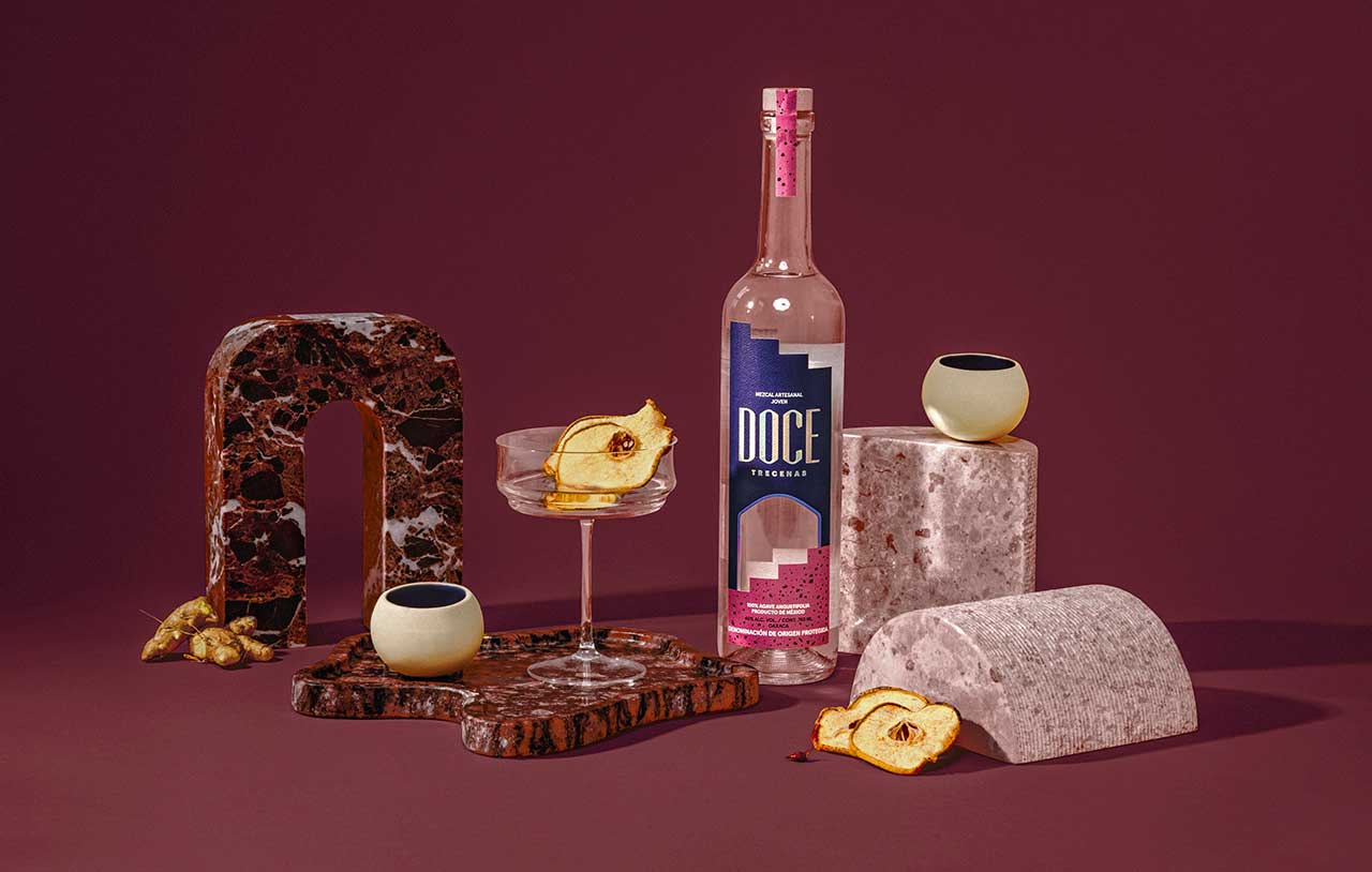
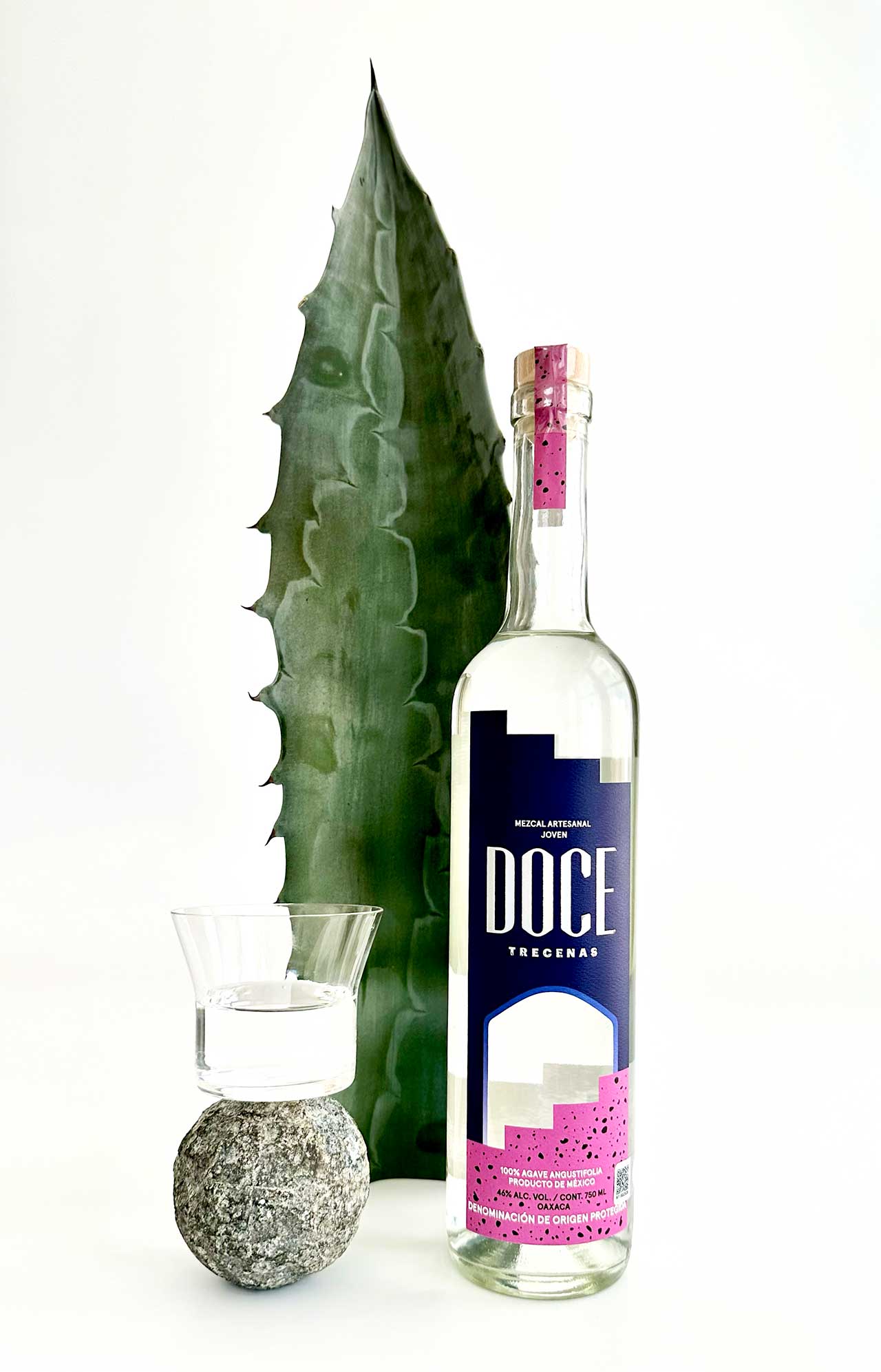
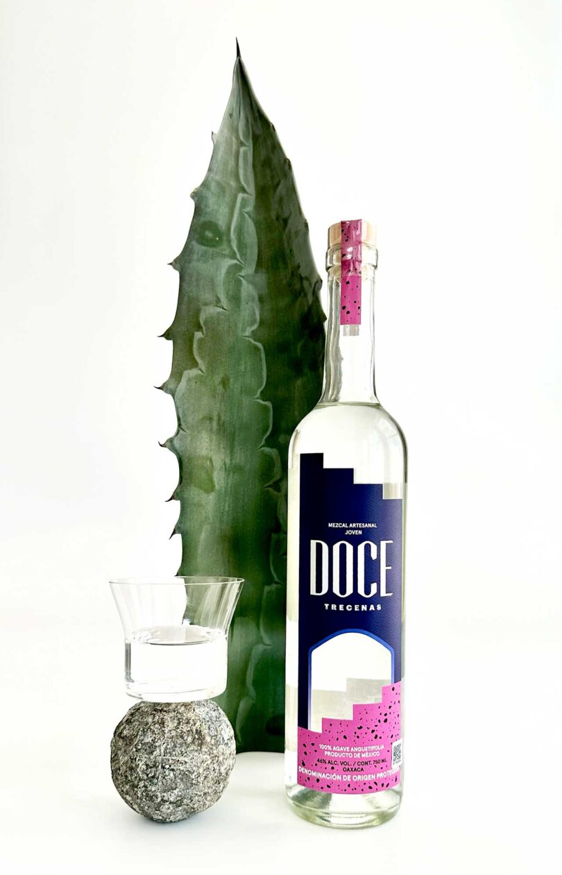
Designed by Morgan Light, the bottle packaging inspiration was pulled from an ancient Mayan calendar showcasing the philosophy of following the pathway to reach your highest self at 12 & 12 each day. With its bold colors, holographic type, a step pattern cut-out, and laid paper texture – the bottle is recognizable, reads quality, and resonates with conscious consumers seeking cleaner, mindful choices connecting to their core ethics.
Below are some highlights from my interview with Gabriela Lawrence, Doce’s Co-Founder + Chief Communications Officer, after being schooled on the proper way to sip mezcal slowly with a slice of orange. Doce did not disappoint with its aromatic start, and flavorful smooth finish.
Can you discuss the role of packaging design in creating a luxurious and premium feel for your mezcal? What specifically about your typography, color palette, and overall aesthetics choices incorporates the rich history and heritage of mezcal-making?
Packaging was one of the major lighthouses when building the brand identity. Doce Mezcal’s visuals are the culmination of both the vibrancy of Mexico paired with our founder’s previous backgrounds and personal affinity for fashion and style. Color can be found all over Mexico – and we were inspired by the vibrancy within the region’s flora, the street art, and visuals across the country. Our previous careers in fashion also directed the way we approached packaging, playing with color, and texture to create something visually stimulating. Mezcal is a true gift from the earth, its dynamic, filled with heat and created with passion and tradition. We realized most options available on the back-bar and on the shelves of our local liquor stores didn’t echo the stylistic tastes of today, and many felt detached from our modern ideals. Mezcal is a spirit that is traditionally experienced with friends and loved ones. We wanted to create something that people would be excited to share and engage with – packaging that excites you and makes you take a second look. The goal was to create a product that exceeds your usual expectations when it comes to spirits, one that earns a coveted spot in your beverage rotation.
Did you collaborate with any designers or agencies during the brand creation process? If so, how did you ensure a seamless partnership between the design team and your brand’s vision?
Our internal team spent months gathering creative references and inspirations that we felt best encompassed our brand identity. When it came time to create the final product – we were led to our designer Morgan Light who we met through the former women’s networking group + Coworking Space – The Wing. Morgan’s experience working in beverage + lifestyle brands within beauty & wellness coupled with her like-minded aesthetic made her the perfect partner for Doce. Together we worked hand-in-hand pairing our team’s vision with Morgan’s creative expertise. We went back and forth with weekly check-ins sharing historical references and creative inspirations, and after a few months and iterations we were able to bring the final product to life.
How did you incorporate sustainability and environmentally conscious practices into your brand’s design and packaging?
As an emerging brand, when building Doce Mezcal we focused on the details. Small changes that would make a big impact in the long run as we grew and scaled. Creating with recyclable and reusable materials, taking into consideration factors such as bottle weight and certain types of bottle caps, label paper, and more were at the forefront when dictating design decisions. Every part of Doce Mezcal from cap to paper to bottle is environmentally conscious.
What book have you read solely based on the cover design? Did it live up to the judgement?
Anything by Assouline never falls short. Their coffee table books are always equally as stunning on the outside as the content on the inside. The Windows at Tiffany & Co. was the most recent buy. Coffee table books are always known for the visuals, but this edition served dual parts stunning imagery + informative of the brand’s creative history. A treat for fashion lovers.
Pinhook Bourbon
With a steadfast commitment to tradition, an eye for contemporary design, and a nod to the equestrian world, Pinhook Bourbon & Rye stands as an embodiment of artistry, flavor, and the indomitable spirit of Kentucky.
Breaking away from convention, Pinhook takes a winemaker’s approach to craft bourbons, creating and releasing a unique vintage year after year. Rooted in the concept of using oak barrels as terroir, their whiskey-making process yields exceptional results that captivate both seasoned connoisseurs and newcomers to the world of whiskey.
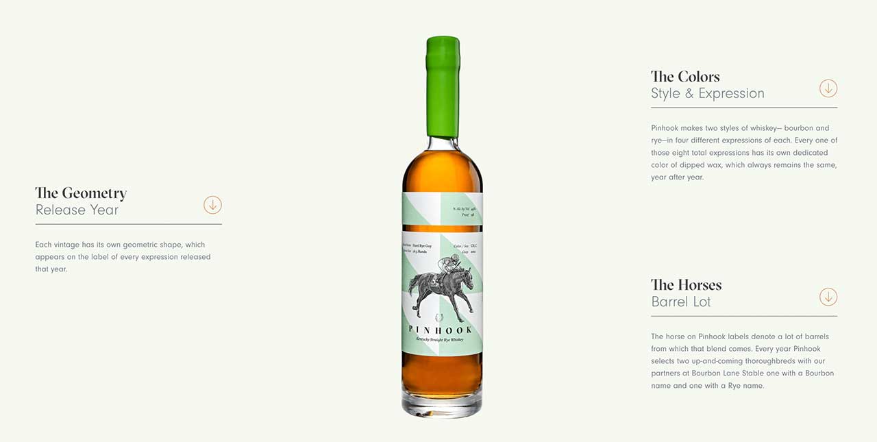
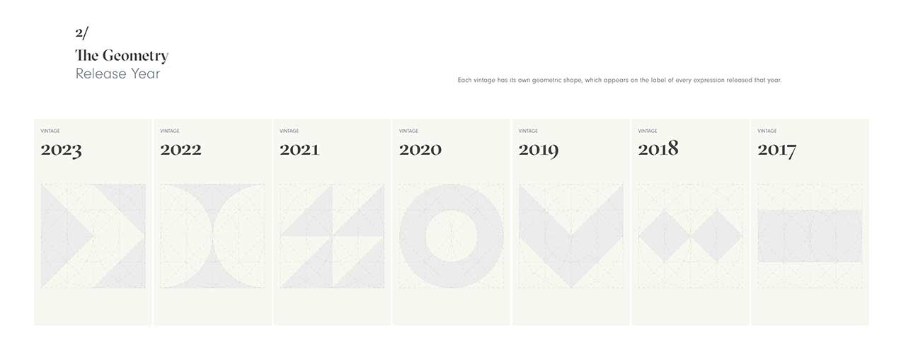
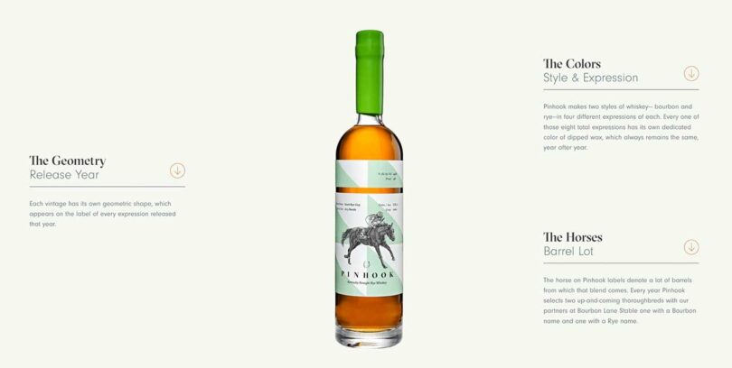
Beyond this approach, Pinhook also pays homage to Kentucky and the rich parallels between horse racing and whiskey. Bottles are inspired by the vibrant colors and bold geometries of jockeys’ silks, and each vintage is dedicated to a new and promising thoroughbred, tying the spirit of both industries seamlessly.
The very name Pinhook draws inspiration from the old Kentucky term for acquiring young thoroughbreds, nurturing them as they mature, and ultimately selling them when ready to race. This analogy finds a profound connection with whiskey-making, where success is a harmonious blend of instinct, experience, quality appreciation, a touch of luck, and, above all, patience.
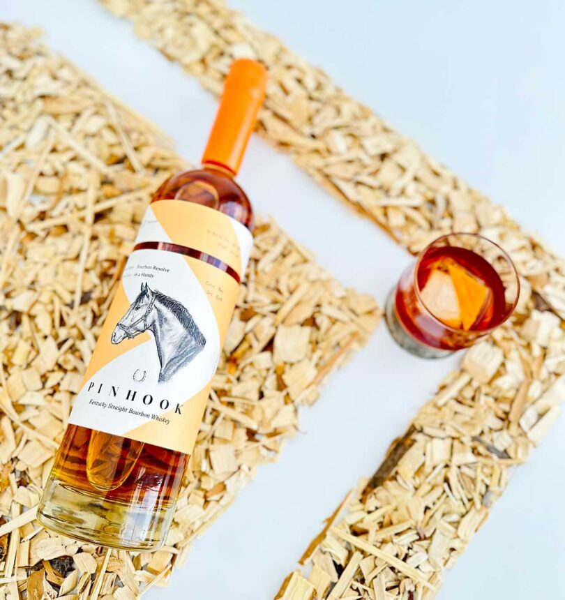
At first glance, Pinhook’s bottle reads quality and authentic. With thoughtfully clean graphics that are not overly modern or trendy, the bottle neck is dip sealed with a slightly muted bright color wax to match the geometric color pop pattern on the label. Clearly the brand prioritizes the user experience and has a very straightforward pull tab for opening the wax seal effortlessly.
Behind this brand stand the three original co-founders, each contributing their unique expertise: Sean Josephs, the Master Blender; Jay Peterson, the Wharton business expert; and Charles Fulford, Pinhook co-founder who designed the brand’s packaging. The trio’s collective efforts proved so successful that they convinced Alice Peterson, Jay’s wife and Harvard Business School alum, to take on the role of CEO when the side project evolved into a year-round business.
Below is more of what I learned straight from the horses’ mouth… Alice Peterson, Pinhook CEO and Charles Fulford, Pinhook Co-Founder and Chief Brand and Marketing Officer.
How long has Pinhook been in the bourbon business and what are your most popular markets?
Alice Peterson: Pinhook’s journey began in 2010 when we acquired a set of barrels. In 2011, we purchased 20 full barrels in Indiana as we sought a distillery that could distill to our exact specifications. Our first bourbon was released in 2014, and by 2017, we had our first year-round product. Since then, we’ve expanded our presence and are now available in 30 different states, with California, New York, Louisiana, Kentucky, Ohio, Colorado, and Illinois being our largest markets.
Can you share the unique characteristics and flavor profiles that set Pinhook apart from other bourbon/rye brands?
Alice Peterson: We tend to bottle at a pretty high proof alcohol content. We do that because we want it to stand up to a cocktail and dilution. We want you to tell that it’s a rye cocktail, and taste it, unlike the vodka lemonades that are “so good – I can’t even taste the vodka.” Because we’ve set ourselves free from uniformity and consistency, we can play with the alcohol integration until we get it right. So, we try different complexities. Basically, play with it until its perfect.
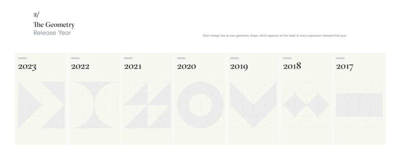
Each year’s release has different expressions due to our wine-like approach, using barrels as the natural ingredients that allow us to compose and combine unique flavor profiles. This results in every vintage having its own label, united by color but distinguished by shapes, creating a visually compelling and varied collection.
How do you envision people enjoying Pinhook, and what are some of your favorite ways to serve it?
Alice Peterson: We want people to feel comfortable and at ease when enjoying Pinhook. There’s no right or wrong way to drink it. It’s accessible to everyone, whether you prefer it neat, on the rocks, or in cocktails. I’ve always admired the versatility of whiskey, and I want to share that with others. Tying back to the brand and the spirit of hospitality, one of my personal favorites is to prebatch a cocktail, put it back in the Pinhook bottle, and bring it as a hostess gift.
The bottle itself is beautiful. Sometimes I feel like if I appear at someone’s house, and they’re hosting a dinner and I put a bottle of bourbon in their hands, it’s almost like giving people flowers without a vase… And who doesn’t love offering a cocktail. Most people haven’t prepared a cocktail for a dinner. And so you’re adding something super easy and ready to go feels like it’s helpful as opposed to potentially intimidating.
Batched cocktails are also great to keep in the fridge, the flavors can infuse and it speeds up service. Even if you still need to shake a la minute, they are labeled with simple wrap around tape, ready to serve to unexpected guests without pulling out the cutting board. You can just grab a glass and pour. For that reason, all our recipes have a single serving and batch version on the website.
Alice introduced me to the “Boulevardier,” a bourbon version of a Negroni. The cocktail is delightfully simple, and easy to sip. A great evergreen cocktail that suits all seasons.
8oz of Pinhook rye
8oz of Forthave Red
8oz of Antica Sweet Vermouth
Simply combine all the ingredients and dilute with 4 ice cubes, funneling it back into a Pinhook bottle. Serve it over ice and garnish with an orange peel.
Can you discuss the role of marketing and packaging design in creating a luxurious and premium feel for your bourbon/rye? Besides your typography, color palette, and overall aesthetics choices what else incorporates the rich history and heritage of whiskey-making?
Charles Fulford: We discovered that the 275 whiskey products on the market all came from 13 distilleries. Revealing that most brands don’t have their own still, and rely on the a huge market for buying barrels. So, storytelling becomes the main differentiating factor. And the story out there is always about the same – faux antiqued grandpappy recipe found in the barn by the creek. We felt an enormous opportunity to do something different aesthetically. With my creative agency background – how do we modernize things? These barrels are wildly different. Sean coming from the wine world asked why is the industry not treating this like natural product and treating it more like wine? Instead of hiding behind the curtains – and wasting a lot of products let’s celebrate that it is different year after year.
Let’s not play the same BS game, let’s tell an authentic story. The global industries in Kentucky are bourbon and thoroughbred horses. No one has really put these worlds together beyond putting a horse on the label. So we partnered with a thoroughbred farm, and merged the product with active thoroughbred race horses.
The decision to use bright colors had historical significance. Before the era of phones and screens, at the racetrack, people placed bets and wanted to follow their horse during the race. The distinct colors and shapes on the jockey silks allowed spectators to recognize their chosen horse easily. We metaphorically connected this to people walking into a bar or retail shop and easily spotting Pinhook amidst other bottles due to its tall shape dipped in wax of an extremely bright color, like a beacon on top.
To go further we’ve added an augmented reality aspect to the package itself. People want to know everything about the juice they are consuming. And we have a rich brand story to tell. So we bridged digital and physical – arming people, bartenders especially, with an AR browser base scan code on the back to get the history of that specific bottle from the water, to the grains, to the barrel, the horses career and races they’ve won, and allows people to dive deeper into what they’re drinking.
How did you incorporate sustainability and environmentally conscious practices into your brand’s design and packaging?
Charles Fulford: Biggest impact with paper type and soy inks.. and trying to be as sustainable as possible in all our choices. The larger environmental challenge – initially we wanted the weight of bottle to have a heft, as it connotes quality. People think of weight with being premium. But there is a tax on that, case weight is heavy. And shipping takes a toll on environment. With our current production numbers, we are discussing creating our own custom bottle mold to address this issue.
How did you consider target audience – and balanced the existing and new customer through design choices? Did you collaborate with any designers or agencies during the brand creation process?
Charles Fulford: We needed to teach people that we are a singular brand with consistent identity but with varying annual releases.
Introducing Pinhook to a broader audience without alienating existing audiences – balance was key. You could come too far left field with packaging, do something hyper modern, but then alienate a large group of traditional folks. We wanted to balance traditional and modern.
We collaborated with Noli Novak, a Wall Street Journal illustrator, to create pen and ink portraits of thoroughbreds for each bottle. Noli’s illustrations act as a hat tip to heritage olden times, and the bright colors and geometry help balance it out and make it seem modern. The word mark and typeface is from Grilli Type – GT sectra, a serif type leaning to the past, but with angular elements looking very modern in certain light.
We wanted beautiful bottles, friendly for all, to be admired on the shelf, instead of the tired masculine narrative and aesthetic. The bouquet of fruits, herbs, and floral tastes lean more like wine and gender neutral then the typical manly attributes of tobacco and butterscotch. Through packaging and branding we aim to widen the aperture of the audience.
Have you received any notable recognition or awards for the design of your brand?
Charles Fulford: We received a silver medal at the San Francisco World Spirits Competition when we submitted Pinhook.
What book have you read solely based on the cover design? Did it live up to the judgement?
Charles Fulford: I know where you’re going with it… In the wine world – if someone has the aesthetic eye to put together an absolutely beautiful label, chances are they are putting the same craft and care into the bottle too. FLOWERS wine, for example – stunningly simple, paper quality, embossing, typeface, this is going to be beautiful wine inside because they put so much care into the brand.
Something & Nothing
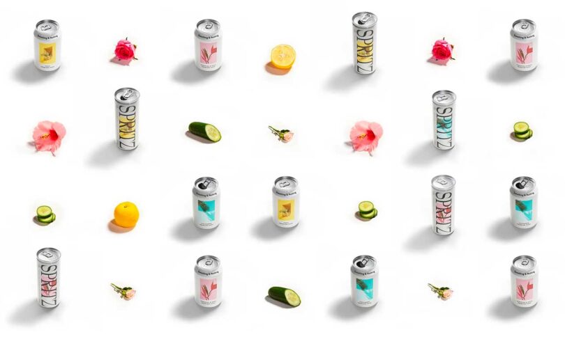
The award-winning brand from the U.K., Something & Nothing officially launched in the U.S. this May. Founder Olly Dixon’s background in design is reflected in the premium spritzes he’s developed that lead with flavor and natural ingredients and are inspired by travel and nature.
After starting his career in music, Dixon transitioned to running an award-winning cultural agency called Margaret. But it wasn’t until he opened his own pub that the idea for Something & Nothing came to be. First with a quality non-alcoholic soda, and then the Spritz.
Something & Nothing spritzes are made with the highest quality natural juices, extracts, and botanicals. But it’s the artistic & graphic packaging design that highlights their commitment to refresh people and planet, both literally and holistically, through inspirational ideas, moments, experiences, and culture. Oh and let’s not omit the funny connection the brand name has to my favorite TV buddy George Costanza – “It’s about nothing, everyone is doing something we’ll do nothing.”
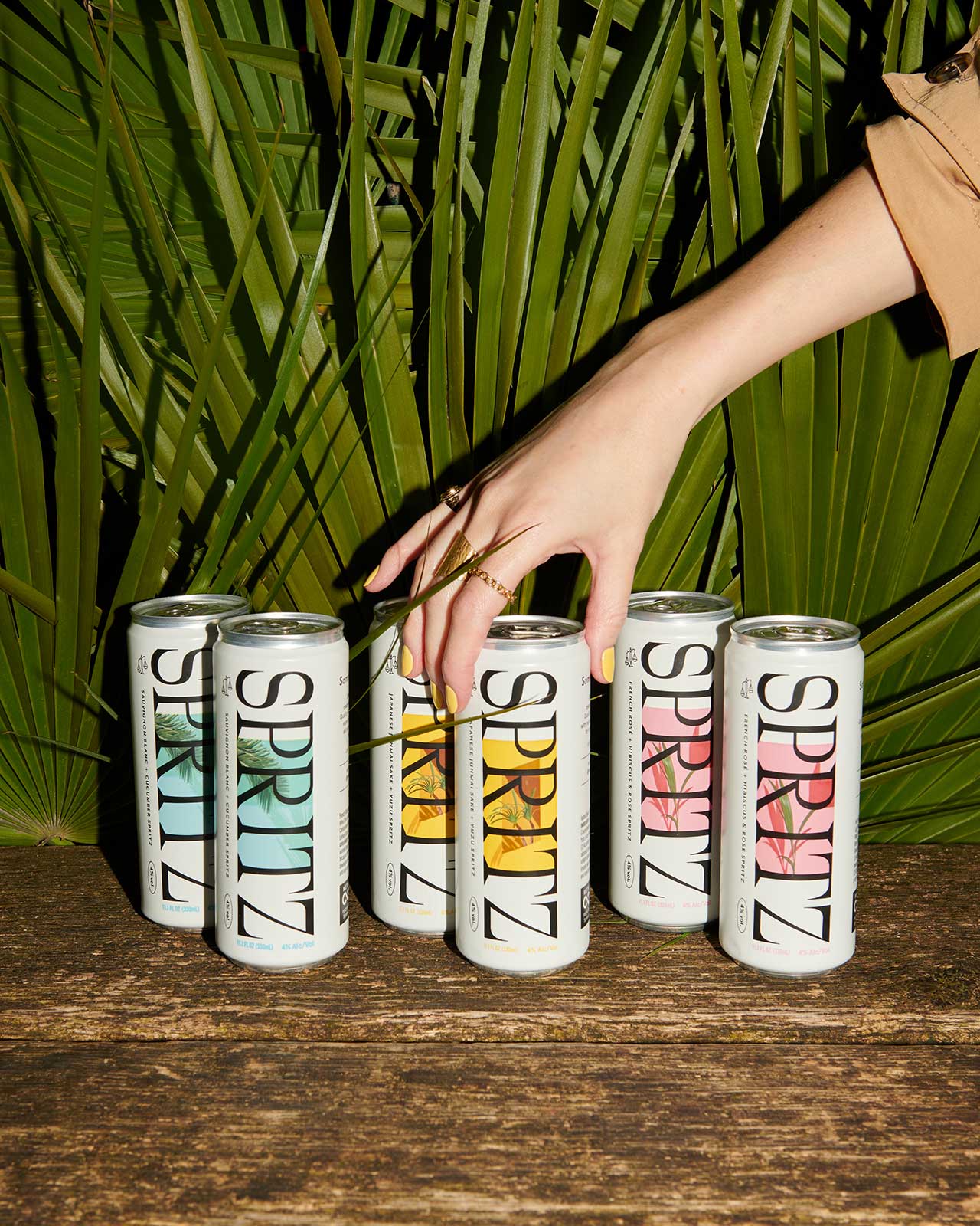
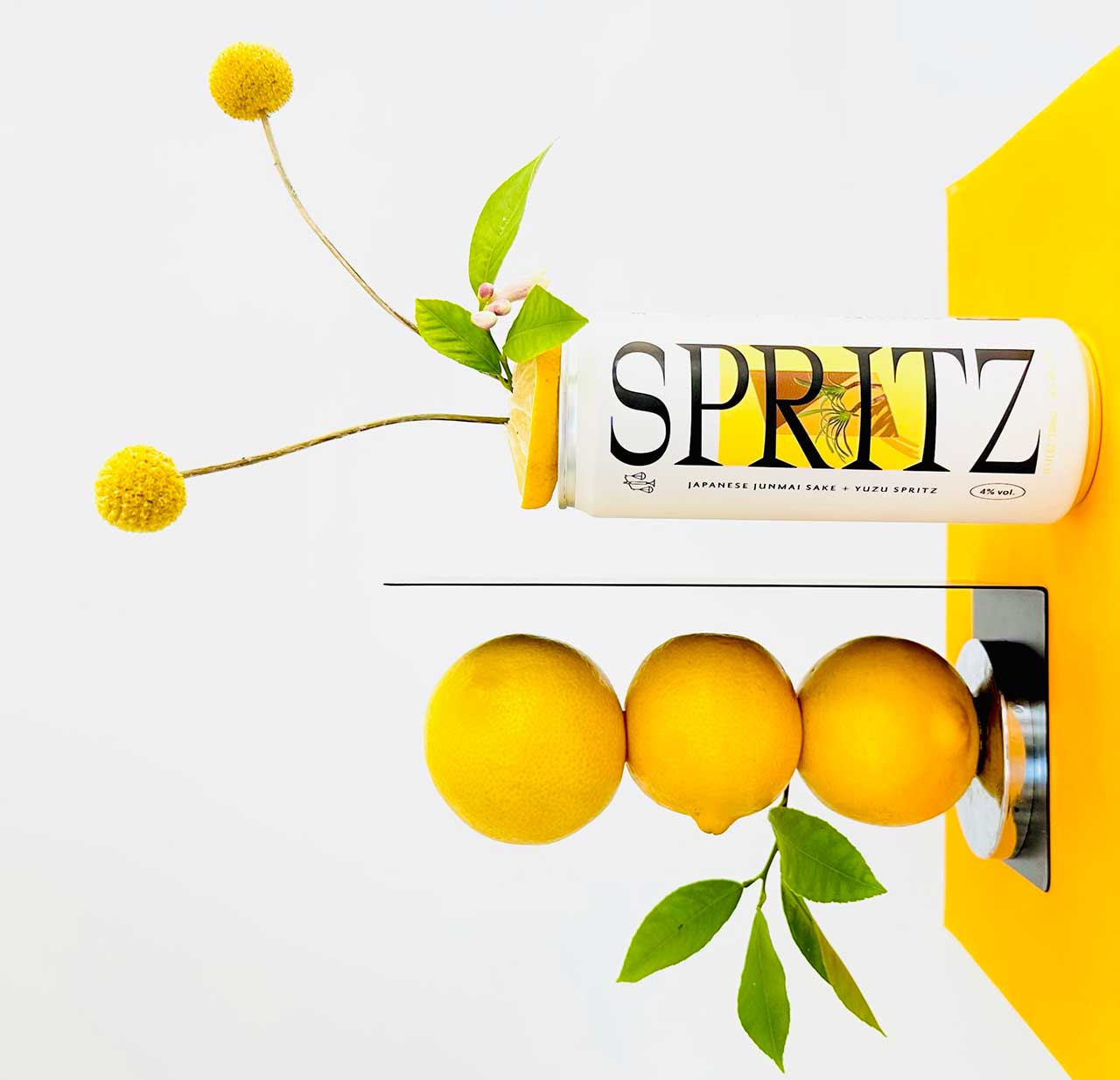
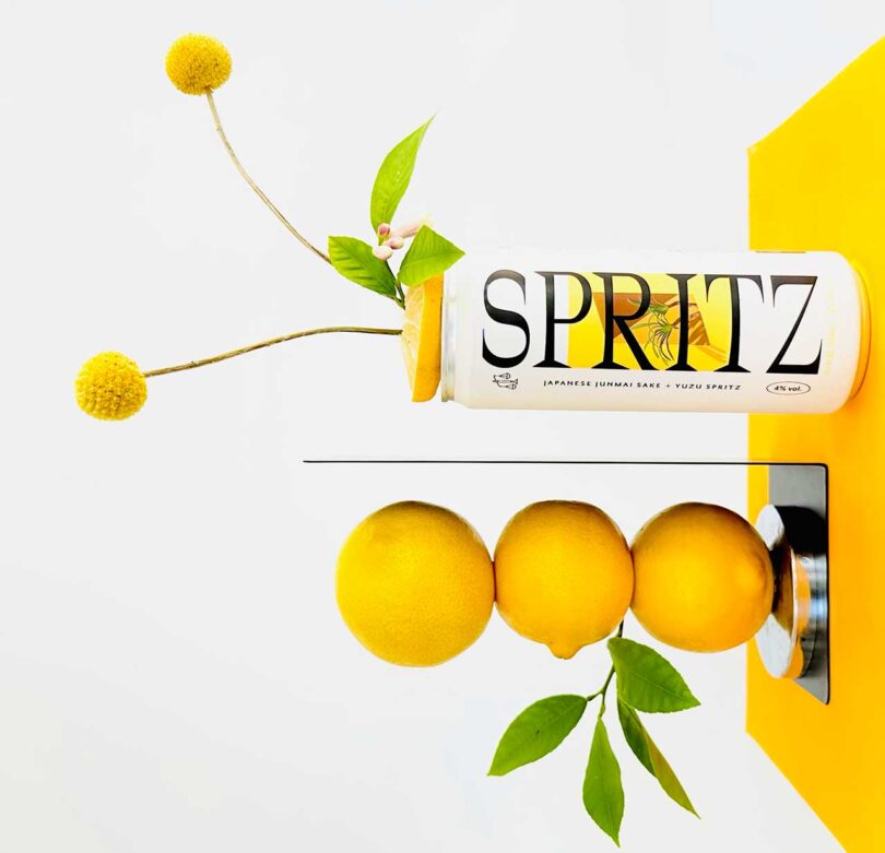
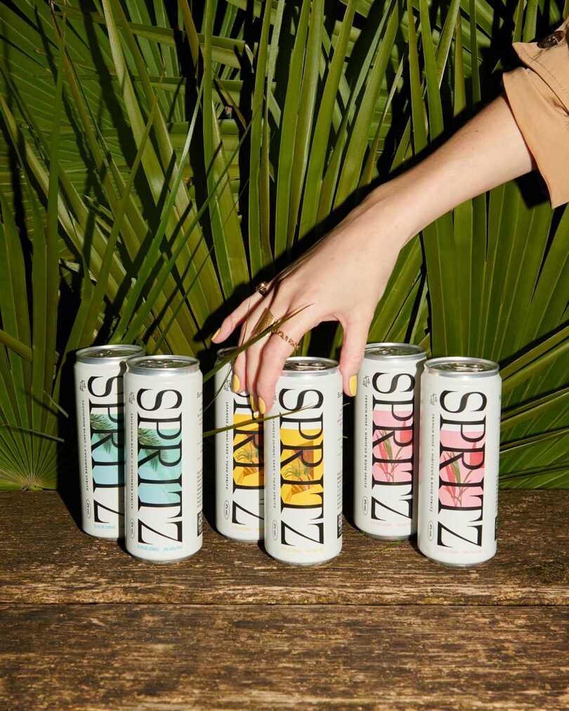
The latest of the three expressions of premium spritzes … is the Japanese Junmai Sake & Yuzu. By carefully blending dry, umami and tart Junmai sake with complex and aromatic natural yuzu juice and botanicals, the gently effervescent spritz claims to taste like wandering Kyoto’s backstreets at golden hour. That said, I found the subtle flavors paired nicely with Nozawa-style sushi from Sugarfish.
The fresh and green Sauvignon Blanc & Cucumber claims to taste like running through a vineyard naked. I paired it successfully with grilled daurade dowsed in lemon butter and sprinkled dill flower.
And lastly, the French Rosé + Hibiscus & Rose Spritz is a nice option for terrace snacks at sunset. Leaning into a pale, dry French Rosé from the Côtes de Gascogne with complementary botanical and tart flavors from rose & hibiscus, the subtle bubbly tasted lovely with a summer pavlova topped with raspberries and white peaches.
Below are some design specific insights from my interview with Something & Nothing’s Olly Dixon. He is also founder of the Glimpse Collective, a group of artists, illustrators, copywriters, and makers who come together regularly to imagine a better world… and create a glimpse of it.
Can you discuss the role of packaging design in creating a luxurious and premium feel for your Spritz? What specifically about your typography, color palette, and overall aesthetics choices incorporates the essence of your brand?
The Spritz are an extension of the core brand, using all the elements of the Soda – the white frame, the imagery, the minimal design, and typography – but adding a more elevated feel that works for the alcohol occasion. This was achieved through the format change (the taller can) and the use of a bold, classic, angular typeface running along the can saying SPRITZ. The classic angular font plays off the core design elements of the brand, elevating and modernizing. The design and brand positioning for Spritz had to work for Wine and Sake, both of which have a legacy of craft and tradition but the way we have blended them with natural ingredients, water, and carbonation lifts them and brings a new energy. The design hopefully reflects this.
Did you collaborate with any designers or agencies during the brand creation process? If so, how did you ensure a seamless partnership between the design team and your brand’s vision?
Before starting Something & Nothing, I had a creative agency and the designers I collaborated with all the time were Studio AS/CC. I’ve worked closely with Studio AS/CC for several years now, firstly with my creative agency Margaret and then on collaborative projects such as Birch hotels where we developed the strategy, brand, and launch campaign together. So, when it came to developing Something & Nothing, we started exchanging ideas and visual references and having a lot of conversations years before it came to life. What we created probably wouldn’t get past most traditional drinks clients and companies. Something & Nothing is a very pure reflection of our conversations, references, and strategy that we discussed over several months.
What book have you read solely based on the cover design? Did it live up to the judgement?
I used to go to car boot sales a lot, mainly to buy vinyl but occasionally a book would catch my eye. I picked up a book called The Doyle Diary which was a collection of illustrations from Charles Doyle, the brother of Arthur, the author of Sherlock Holmes. The cover shows a strange skeleton wearing a pagan crown shaking hands with a gentleman in a suit.
Inside it’s full of detailed illustrations of nature mixed with mythical creatures and weird combinations of dark humor, horror, and charming country scenes. They are illustrations made whilst Charles Doyle was committed to a facility. He was seen as “mad” back then, now I believe he would have been viewed as a genius.
So there you have it… three brands that captivate consumers through their packaging designs, embodying their pleasantly tasty spirits and beverages with a touch of narrative and artistry. Happy Summer Sipping!

